

Yet another big story for the UFL as they announced their outfitting partners and the official new looks for each team going into the 2026 season. In years prior, under Dwayne “The Rock” Johnson’s leadership, the United Football League used Under Armour for their uniforms and outerwear, as there was a direct correlation because of Johnson’s clothing line, “Project Rock.” Now they have split the responsibilities between three separate companies, and none of them is their former partner.
Starting with the training footwear partner for the UFL, Mike Repole’s own sports apparel company, NO BULL, will take the lead on that one. This was expected, seeing as Mr. Repole’s been very active making the UFL more alive this season, so he wants to be as interactive as possible with it. On the flip side, Adidas will be the official Game footwear partner. It is a bit odd that they are going with two separate companies for footwear, but, like the point before, Mike Repole might have just wanted to have his company involved in some way. Now, the big shakeup was the jersey and headwear partner that the UFL has now decided to confide in. Over the past couple of years, Under Armour has done jerseys, and 47 handled the hats. Now they have consolidated it to one company for both.
New Era is now the official jersey and headwear partner for the United Football League. Now I know this confused me because while New Era hats are common in the sports world, the jerseys are a bit hidden away. I did not even think they made them before, and that confused mabouton their legitimacy for designing them. However, they have had years of experience as they are the jersey provider for the Canadian Football League. While that may not be popular here in the States, their jersey qualities and design have been solid, and it shows with the new UFL uniforms.
Speaking of the uniforms, the UFL has unveiled all eight of the team uniforms for the 2026 season. Their marketing team was a genius as they only unveiled two a day for four days. The first day was D.C. and Dallas, the second was our beloved St. Louis and Birmingham, the third was Houston and Columbus, and the last two capped it off with Louisville and Orlando. Now I want to show each of these off and give my thoughts on the individuality for them, starting with some of the new teams.
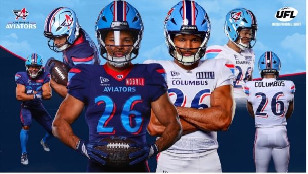
Up first is the new “rival” from the historic city of Columbus. This uniform perfectly blends their history of aviation with the multiple variants of sky blue and bright colors to get that right feel. While I am not a huge fan of the color disparity between the helmet and the home uniform, I think it blends perfectly with the away uniforms, with the primary white and slight accent of the deeper colors. Talking to a friend of mine from Columbus, I know the community is excited to see these in action.
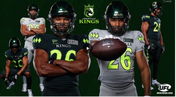
Now, Louisville approached this in the right way and created one of the better uniforms in the UFL right now. They used the reputation for horse racing in the design, not only with the logo, but with the diamonds all down the sides of the pants and on the shoulders. There is also a Fleur de Lis in the middle of the diamonds on the shoulder, respecting the heritage of Louisville. Finally, the helmet isn’t black like you might think at first glance; it is actually a deep green that shines in the light. This should be the standard for new uniforms in the market, accenting the deep city’s history.
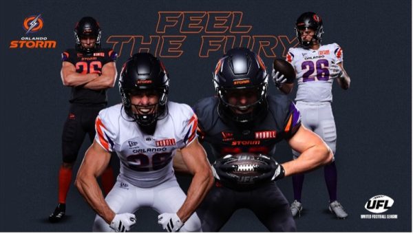
This is probably my least favorite out of all the new team uniforms because of how bland they feel. The home jerseys look as though they are ripping off the Rams’ Nike Rivalry design, and the aways are just as guilty, but with the Rams’ default aways. I feel the purple and orange could’ve been incorporated with a unique style, like purple primary for home and orange primary for away, but instead they opted for an all-black home uniform. Here’s hoping we may see some alternates and get some originality in Orlando.
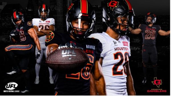
This is my second-favorite uniform to come out of the UFL. Houston is no longer the Roughnecks and goes back to being the Gamblers from when they were in the USFL, and man, did they have fun going back to their roots. The helmet brings the original logo with a strong red stripe down the center and yellow stripes bordering it. The jersey and its numbers bring in the orange and yellow to be subtle but pop against both the black and white jerseys. They also added a fun poker chip on the shoulders to really lean into the name Gamblers. The final piece that sets it above the rest is the side stripe on the pants that is bordered by thin stripes of yellow and orange, but is a thick line of spades going from the waist to the knee. This uniform is unique and brings some much needed flair to the uniform department.
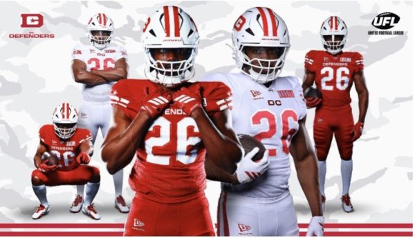
The D.C. Defenders are back, and it’s looking to be more or less the same except for the bucket, which decided to get a downgrade. The jerseys added stripes and stars to the shoulders, and the letters now have a 3D effect on them. The pants are one color with white and red strips going down the side, so they are not too special. The biggest infraction, though, is coming with the helmet. While it is very similar to last year’s, with the stripe down the middle and the D.C. logo, they removed the camouflage from it. This has upset a lot of the fan base because it gets rid of some flair.
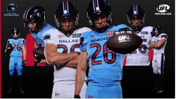
The Renegades are back, and the only notes I can have on this one are that it is against a rehash of years past. While some teams incorporated meaningful nods to their cities or showed off some big flair pieces to set themselves apart, the Renegades decided that “if it ain’t broke, don’t fix it.” The biggest difference is the new primary bandit logo instead of the capitalized R logo. This is another uniform that I hope gets a redesign or an alternate that shows a bit more to the former XFL championship team.
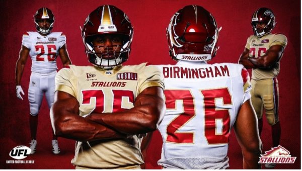
The award for the worst uniform change goes by far to the Birmingham Stallions. While I like the deep red and the fade-away golden stripe on the helmet, that is about the extent of the positives I have for this new uniform. The red that is on the jerseys is more accurate to the old bright red than the new deep red they are using, and it creates an awful disconnect from the whole thing. Obviously, it is the fact that there is no red home jersey like last year, but a “gold” jersey. While it is in their color scheme, the mission of a red jersey is a gross oversight in the design and consideration for the team. Not to mention that the new yellow jersey looks more like someone had an accident on them then an actual gold color. This is easily the worst uniform going into 2026.
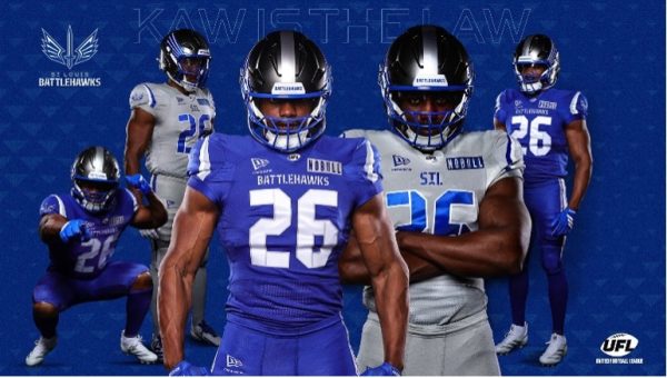
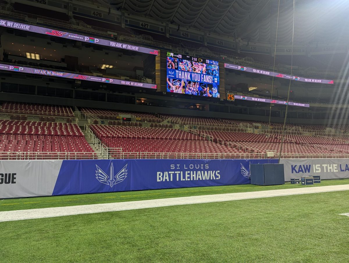
Saved the best for last with the unveiling of the St. Louis Battlehawks 2026 uniforms. STL was in desperate need of a revamp after not having anything really defining since the 2020 XFL season, and other than the issues that I have with the helmet, they delivered. Tackling the helmets, I enjoy the glossy silver matte bright silver stripe down the middle. My issue is with the wings coming out of the eye area. Every iteration, they have shortened the wings to where now it looks more like over-aggressive eyeliner than it does the wings on the logo. I hope they will go back to the 2020 design eventually, but that might just be lost to time. Now, regarding the jerseys, they showed the city some love. The font of the letters and number are militaristic, respecting the history that St. Louis has in the history of military aviation innovation. However, the best piece is the shoulders, where they have the Arch encompassing the Battlehawks logo smack dab in the center. I know I am excited about the possibility of these going on sale and buying one of my own, but until then, we just have to admire them in the photo and at training camp.